Comparing Typography and Design of Fairytale Books for Different Age Groups
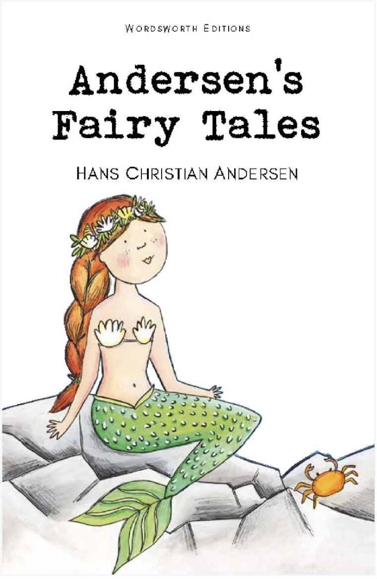
The cover of Wordsworth’s edition of Anderson’s Fairy Tales
Wordsworth Editions is known for its affordable prices, particularly their exceptionally cheap paperback classics. Wordsworth Editions publishes some well known fairytales in their Children’s Classics collection, including both a collection of Hans Christian Anderson’s fairy tales and the Brothers Grimm. The books in this collection feature simple cover art somewhat reminiscent of several well known children’s authors, such as Roald Dahl, indicating a target readership of perhaps eight to eleven years old. This demographic is further targeted via the title font, a serif typewriter-style font that is clear and bold, with clear spacing between the letters, making it an appealing choice for beginner readers.
The company name, ‘Wordsworth Editions,’ is written in a vaguely handwritten style font, identifiable by the asymmetric shape of the letters and the slope of the lines, particularly in prominent curves (e.g. the ‘R’ and the ‘D’), the atypical line weights throughout the text and the angled lines (e.g. the ‘W’) as well, which are clearly visible in the close up image of the logo, shown here to the right. Handwriting fonts are often used in branding to emphasise personal connection or centred around children, which I believe is why this typeface was chosen to represent Wordsworth in their Children’s collection. The author’s name is written in a sans serif typeface and is in all caps in order to separate it from the title, and has a lighter font weight to make the title stand out more.
While the cover successfully portrays a book targeted towards early readers, the text itself is in a fairly small font with very little spacing between the letters, which makes it more difficult for young children just learning how to read. Additionally, there is little to no illustration inside the book itself, which can be unappealing for young children as they might find the text less engaging. This context might shift the target age later, perhaps nine to twelve years olds, as they develop into more independent prose readers, or perhaps a younger four to seven, for caretakers to read aloud to younger children. In addition to the uncertain age demographic, these Wordsworth Edition paperbacks are lower in quality than many other options that you might find elsewhere. One thing you might note is that there is no translator credited on the book, which can indicate a less accurate, lower quality edition. Many Wordsworth Edition buyers also complain of flimsy construction and poor materials, remarking on the disproportionate wear and tear on their Wordsworth Edition paperback following only a single reading. This seems to be part and parcel of their boast of being one of the cheapest classic book publishers in the market.
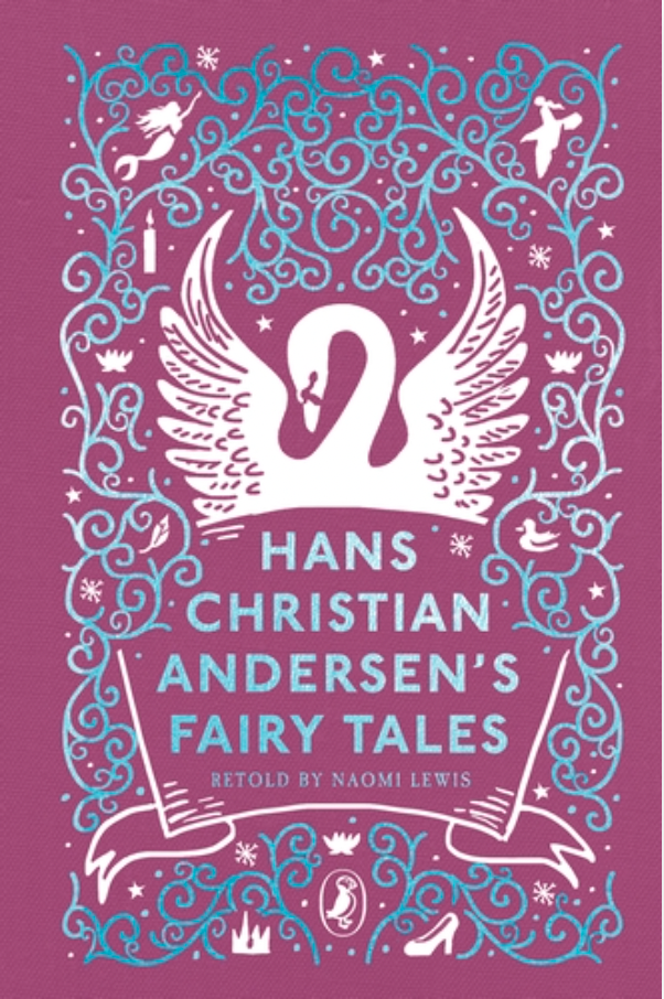
The cover of Puffin’s Clothbound edition of Anderson’s fairy tales
For an option that is higher quality, but still fairly affordable, Puffin’s Clothbound Classics contains several myths and fairy tales as well, including Hand Christian Anderson’s fairy tale collection. The books in this collection are clothbound hardcovers, usually a solid colour background with some sort of abstract design reminiscent of Penguin’s clothbound classics, linking the children’s editions with the company’s better-known product line, combined with an illustration of some significant imagery from the book. In the case of Hans Christian Anderson’s stories, shown in the image to the left, there is most prominently a swan, a reference to his well known fairy tale ‘The Ugly Duckling,’ or possibly another of his fairy tales, ‘The Wild Swans,’ both of which are included in this book.
Additionally there are motifs related to various other tales throughout the cover. The title font is a blue sans serif typeface. Sans serif fonts tend to be used to denote modernity, though with a classic book, it may be aiming more for accessibility and approachability. The colour blue, meanwhile suggests reliability and trust, which is fortified by the all caps typeface, which is often used to suggest quality, as often consumers find that more premium brands use all caps in other industries, such as fashion and beauty. This edition is directed towards eight to eleven year olds as well, which you can tell particularly because of the bold colour scheme; magenta is often used in marketing because it is very eye catching and tends to generate positive feelings, though not generally perceived as very mature or sophisticated when used in larger quantities. By using magenta as the primary design colour, the cover comes across as quite youthful.
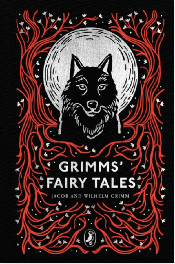
The cover of Puffin’s Clothbound edition of Grimms’ fairy tales
Other covers have different bold combinations, such as a bright red on a black background on Grimms’ Fairy Tales, and a yellow and cobalt blue combination on Roger Lancelyn Green’s Tales of the Greek Heroes. Additionally, Puffin is well known as the youth imprint of the larger Penguin brand. As an established publisher of children's books, having these books as part of the Puffin body of work will signal that the books are directed to a younger audience, especially as the logo is displayed fairly prominently on each cover.
The interiors of the fairy tales have illustrations which will increase engagement with younger readers, and the serif font is larger than that of Wordsworth, with more space between the letters. The prose structure combined with illustration makes these an appealing option for children who are learning to read chapter books, perhaps nine to twelve year olds. Additionally, the book is fairly sturdy and long lasting, and consumers have expressed pleasure with the quality of the book for the price, which usually hovers around twelve to fifteen British pounds. The translators are credited on the covers where applicable, which indicates a better quality product and a more accurate translation.
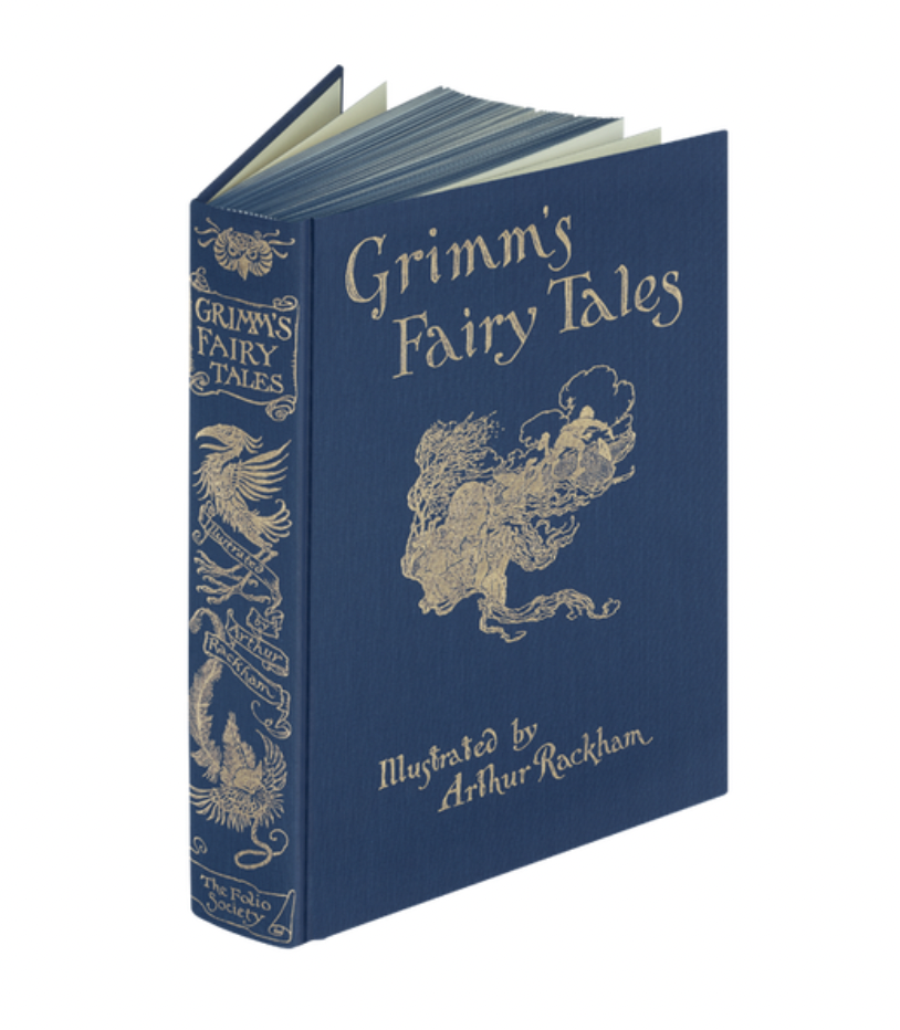
The Folio Society’s edition of Grimm’s Fairy Tales
Finally, I am looking at The Folio Society’s collection of myths and fairy tales. The Folio Society publishes high quality books for high prices. A book from their myths and fairy tales collection will most often cost seventy to eighty British pounds, though their most expensive book in the collection - a limited edition copy of Beowulf - is priced at six hundred and twenty five British pounds. The covers have complex, thematically relevant designs, and are bound in blocked cloth, and are deep or muted colours, such as the navy of their edition of Grimm’s Fairy Tale.
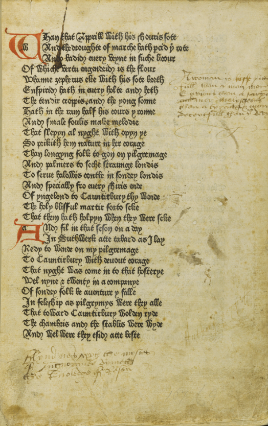
A page from an early edition of Canterbury Tales
The cover design portrays an effort towards authenticity. The design itself is gold stamped on a solid colour background, a style that was notably popular in the nineteenth century, when the Brothers Grimm were writing and being published. The title and illustration credit are in a vaguely gothic or blackletter typeface, which is often associated with folklore and fairy tales. This particular font is reminiscent of some of William Caxton’s early typefaces, variants of which were used to publish the first several editions of Chaucer’s Canterbury Tales. Additionally, even after the blackletter font family fell out of common use in most western European nations, it remained popular through the 1870s in Nordic countries, including Denmark, where Hans Christian Anderson wrote and was published. Both of these give consumers a strong association between blackletter typefaces and fairy tales and folklore. That association with historic authenticity is carried throughout the pages of the book as well. The typeface used for the text is Scotch Roman, a font characterised by wide letters, short ascenders and descenders and strong capitals, and was most popular in the early nineteenth century, and was commonly used during the lifetime of the Brothers Grimm. Additionally, the mix of colour plates (full page coloured illustrations) and black and white illustrations is contemporary to their works as well, as lithography was first used in publishing in 1812, and over the course of the nineteenth century began to replace monochrome illustrations.
This attention to detail is characteristic of The Folio Society’s publications, as they brand themselves as a publisher of books specifically for book lovers who are looking for exceptionally high quality editions of beloved books. Often, their customers are forming a collection, or looking for a book as a keepsake. This is also clear through the publication details that the Folio Society provides about each of their editions. Most publishers provide page numbers and dimensions, occasionally also including the binding material. The Folio Society website provides much more information. For example, when buying their edition of Grimm’s Fairy Tales, you can easily see that the book is bound in blocked cloth, is set in Scotch Roman, contains a frontispiece, thirty eight colour plates, and fifty five black and white illustrations, has sprayed edges, and includes a plain slipcase.
All three companies publish fairytales at distinctively different price points, and the treatment and quality of the different publications are quite different. One major difference is how they are categorised. Wordsworth publishes their fairy tales in a collection of ‘children’s classics,’ alongside works like Antoine de Saint-Exupery’s The Little Prince, Rudyard Kipling’s The Jungle Book, and L.M. Montgomery’s Anne of Green Gables. Puffin, though still directed to children’s publishing as a whole, has included their fairy tales among a more general list of classics, alongside Emily Brontë’s Wuthering Heights, Bram Stoker’s Dracula, Mary Shelley’s Fankenstein and others. Finally, The Folio Society has a section dedicated specifically myths and fairy tales, which includes singular myths and legends, such as Homer’s The Iliad and Wu Ch’eng-en’s Monkey, collections both of authors, e.g. Grimm’s Fairy Tales, by culture, such as a collection of Italian folktales, or subgenres, like Andrew Lang’s collection of nursery rhymes. The Folio Society differs from both other publishers because they treat fairy tales and folklore as a category in and of itself.
Because of the difference in treatment, there is a range of offerings from each publication. Far and away themost diverse collection is the myths and fairytales from The Folio Society. I have just touched on several of their options, but also worth mentioning are guides to lore, such as John Cherry’s book about mythical beasts, and modern iterations of the genre, like William Goldman’s The Princess Bride, and Neil Gaiman’s American Gods. Puffin’s Clothbound Classics series is probably lacking the most in terms of fairy tales compared to the other two collections. Puffin categorised fairy tales with ‘classics,’ which includes a wide scope of genres, and thus only has the most prominent options from a western perspective; Grimms’ Fairy Tales, Hans Christainson Anderson’s Fairy Tales, as well as a collection of Greek myths. Finally, Wordsworth Editions publishes fairy tales as part of their ‘children’s classics,’ a genre that is dominated by fairy tales. However, Wordsworth Editions is the only company of these three to not include any mythology, likely due to having the overall youngest target, and because mythology is generally not produced in picturebook format throughout children’s publishing. Though overall having a very western perspective, there are options like Tales from the Arabian Nights that provide some diversity.
To summarise, consumers will find that Wordsworth is targeting the younger audience of the three publisher, made clear by the cover art in the style of well known kids’ books illustrator, and focusing strongly on affordability, shown not only by their cheap prices but comparatively low quality construction. Opposite to that is The Folio Society, who focus on creating a high quality product over all else. They target the oldest audience, publishing books as collectible or keepsakes, meant to both last and be displayed. The prose is more complicated, and the design choices, such as font, were made with a focus on authenticity more than readability compared to the other collections, indicating an older, highly literate target audience. Finally, comfortably between the two is Puffin, which, despite its comparatively minimal options, is significantly more affordable than The Folio Society’s publications with a stronger focus on readability, while also being far more durable and collectible than Wordsworth Edition’s paperbacks.
This writing was originally produced as coursework at Oxford Brookes University in 2023.
